1
2
3
4
5
6
7
8
9
10
11
12
13
14
15
16
17
18
19
20
21
22
23
24
25
26
27
28
29
30
31
32
33
34
35
36
37
38
39
40
41
42
43
44
45
46
47
48
49
50
51
52
53
54
55
56
57
58
|
library(ggplot2)
library(latex2exp)
library(mdthemes)
library(ggrepel)
library(tidyverse)
setwd("E:/220625_PC/R workplace/220320_SXL/202404_Fig/240506")
library(readxl)
diff_gene_all <- read_xlsx("DEGs_240506.xlsx",sheet = "new.diff_gene_all_S2",skip = 0)
new.res<- as.data.frame(diff_gene_all)
new.res$group = as.factor(ifelse( abs(new.res$log2FoldChange) > 1 & new.res$padj< 0.05,
ifelse(new.res$log2FoldChange > 1,"Up","Down"),
"NS"))
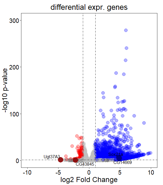
target_gene_1 <- new.res[new.res$gene_symbol %in% c('Ugt37A3','CG43845'),]
target_gene_2 <- new.res[new.res$gene_symbol %in% c('Sox21a','CG14669'),]
new.res_F <- filter(new.res,!new.res$gene_symbol %in% target_gene_1$gene_symbol )
new.res_F <- filter(new.res_F,!new.res_F$gene_symbol %in% target_gene_2$gene_symbol )
My_Theme = theme(
panel.background = element_blank(),
panel.grid =element_blank(),
title = element_text(size = 16),
text = element_text(size = 6),
plot.title = element_text(hjust = 0.5),
axis.text.x = element_text(size = 15,color = "black"),
axis.text.y = element_text(size = 15,color = "black"),
axis.title.x = element_text(size = 18,color = "black"),
axis.title.y = element_text(size = 18,color = "black"),
legend.text=element_text(size=12,color = "black"),
legend.title=element_text(size=15,color = "black")
)
ggplot(data = new.res_F, aes(x = log2FoldChange, y = -log10(pvalue))) +
geom_point(alpha=0.3, size=4,aes(color = group))+
scale_color_manual(values=c( "red","gray","blue"))+
geom_vline(xintercept=c(-1,1),lty=4,col="black",lwd=0.2) +
geom_hline(yintercept = -log10(0.05),lty=4,col="black",lwd=0.2) +
labs(title="differential expr. genes",x = 'log2 Fold Change', y = '-log10 p-value')+
theme_bw()+
xlim(-10,10) +
ylim(0,300)+
My_Theme +
geom_point(data=target_gene_1,
aes(x = log2FoldChange, y = -log10(pvalue)),
size=6, col="darkred",alpha=0.9)+
geom_point(data=target_gene_2,
aes(x = log2FoldChange, y = -log10(pvalue)),
size=6, col="darkblue",alpha=0.9)+
geom_text_repel(data=target_gene_1,
aes(x = log2FoldChange, y = -log10(pvalue),label=gene_symbol),
color="black")+
geom_text_repel(data=target_gene_2,
aes(x = log2FoldChange, y = -log10(pvalue),label=gene_symbol),
color="black")
|